I got this idea from a card I had seen at convention, the only thing that same is the layout otherwise I changed everything else.


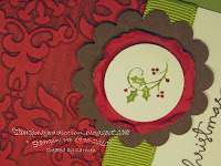
I was trying to figure out how it was embossed with the secondary color so I made a couple of cards to figure it out. The top card I just rubbed on my ink after I had embossed the paper using the Vintage Embossing folder. That wasn't quite right so I rubbed my ink onto the folder directly for the second one and it worked! So you rub the ink on the folder that is indented which is the side that usually has the sizzix/SU logos. Happy Stamping!!


 I was trying to figure out how it was embossed with the secondary color so I made a couple of cards to figure it out. The top card I just rubbed on my ink after I had embossed the paper using the Vintage Embossing folder. That wasn't quite right so I rubbed my ink onto the folder directly for the second one and it worked! So you rub the ink on the folder that is indented which is the side that usually has the sizzix/SU logos. Happy Stamping!!


4 comments:
Yep, I like the 2nd one better. Nice CAS!
I like both cards. Some days you want more color and other days you don't. Now I know how to work it either way! Thanks!
The second one is better, thanks for the tip! Love it!
The 2nd one is my favorite! The ink adds such a vintage feel to your card. Love the crumpled scallop piece.
Post a Comment