Here is the third and last card that I sent in. This was a last minute card I made when I just couldn't decide on the others I had made.
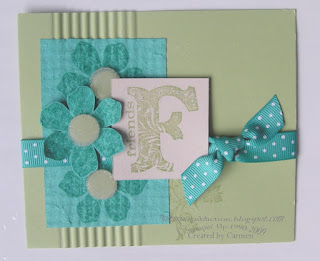
The colors here are Certainly Celery and Bermuda Bay and they go together surprisingly well. I was sure how this vintage set would do in brighter colors but I think it looks great! I crimped the base just a bit to add some texture. The Bermuda Bay piece is done using the
faux flannel technique. I originally had the centers done with Iridescent Ice but I changed them by adding pop up glue dots and microbeads with Certainly Celery as the background and it really softened it up. Happy Stamping!!


 The colors here are Certainly Celery and Bermuda Bay and they go together surprisingly well. I was sure how this vintage set would do in brighter colors but I think it looks great! I crimped the base just a bit to add some texture. The Bermuda Bay piece is done using the faux flannel technique. I originally had the centers done with Iridescent Ice but I changed them by adding pop up glue dots and microbeads with Certainly Celery as the background and it really softened it up. Happy Stamping!!


1 comment:
I'm definitely a fan of the brighter colors.
Post a Comment